Care Management Denials & Appeals rewrite
Saying our healthcare system is challenging is a bit of an understatement. One of the key roles on the front lines of where the disparate goals of the clinical and financial worlds merge are Care Managers. They have to negotiate providing the best clinical care while trying to make sure their hospital will get reimbursed for that care by the various insurers. The juggling act of trying to remember the different payment rules across Medicare, Medicaid, and each private insurer causes a lot of frustration. Despite Care Managers best efforts, the insurers are denying cases at a higher rate. The denials have created an estimated $262 billion a year cost burden on the US healthcare system. Documenting, tracking, and reporting these denial cases and their outcomes is essential for hospitals to reduce their costs.
The CarePort Care Management Denial & Appeals module has long been solution to help the Case Managers track their denial outcomes. However, the current version of the Denial & Appeals (D&A) product was built nearly 10 years ago with ExtJS as the front-end technology. Typical of many software applications, the market for a solution will shift as the technology ages and becomes less reliable. The over 150 clients using D&A were feeling this pain and letting the Allscripts support team know about it.
As the Product Manager, I lead the efforts to research the market, redesign the product, and launched it on a new technology platform with the goal of avoiding attrition of our client base.
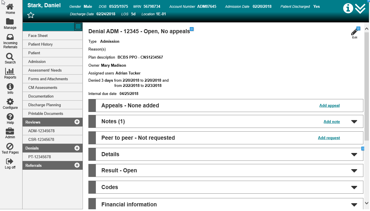
The UI of the legacy Denial & Appeals product.
Product Research
The financial burden of denials. (Credit: 2016 HFMA Presentation: Big Data and Analytics to drive Denial Management Bottom Line improvements)
The research themes that were presented after weeks of analyzing the data.
In order to learn the product and identify what we needed to build, I spent a couple months researching the current usage with both clients and our Services team. This research involved onsite hospital visits, WebEx calls, performing a UI heuristic evaluation, and reviewing Support tickets. We ended up with data from 29 users to help us identify the key problems with the current application. The data was organized with an affinity wall and then analyzed to identify the themes we learned.
One of the Personas created from the research.
It was quickly apparent that the insurance providers were denying more cases, causing lost revenue and a lot of pain for the users. Hospitals were responding with growing their Denial Management teams, some of which were no longer under Utilization Management teams. Denial Management had shifted from an individual to a team sport. In fact, 7 personas were created to reflect this. We also saw an increased number of nurses working from home as a retention strategy to handle the increased number of cases. The current application was no longer reliable and flexible enough to handle the increased number of cases and handoffs that were occurring in the field.
Product Strategy
Strategy document to guide the project.
I developed a product strategy of what was needed to build to address the opportunities discovered during research. I utilized the Positioning Document from The Pragmatic Institute to develop a “north star” for development.
The template is focused on the market problem and features needed to address those problems. I took a product-agnostic approach thinking through an ideal solution, instead of just leveraging what was already built.
The Positioning Document was handy throughout the process, as it allowed me to check in and make sure development was still heading in the right direction.
UI Design
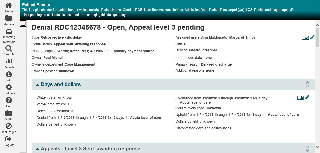
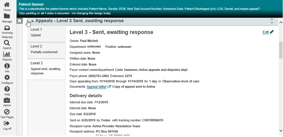
I worked with the UX Lead to list the design implications and business needs for the new Denial & Appeals module. Our goals were to reduce load times, reduce the chance for errors, improve user efficiency, support different size monitors, and make it easier for multiple users to work on a case. Because this was such a strongly used product, there was also a challenging balancing act of including current functionality that our users had come to rely on. We agreed upon a vertical, accordion based design to support the flexibility of showing the user the data they wanted to see in a responsive design. This included separate View and Edit states to improve readability of the data
Many of our clients were excited to see a modern shift in the design. But as expected, there a lot of clients concerned about the change and having to learn a new UI. A lot of end users were on “auto-pilot” since they got used to the navigation. We performed user testing at various points of the design and development process to continue evolving the product. Even the biggest naysayers started getting on board when they saw their staff successfully navigate the new UI.
Requirements gathering and Scoping
I continued to check in with clients as the design evolved to continue gathering requirements. These efforts helped me identify new features that would be included with the new design to convince clients the changes to the product were going to be worth their time. I balanced these features based on the frequency I saw a problem raised and value to the client. The list included:
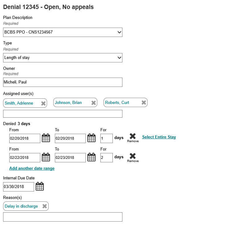
Multiple date range entries - to support denials with non-consecutive days and avoid creating multiple cases
Drag and drop accordions - to support re-arranging the order of the data fields based on the individual role
Configure hiding sections - to allow removal of data fields a hospital is not required to document
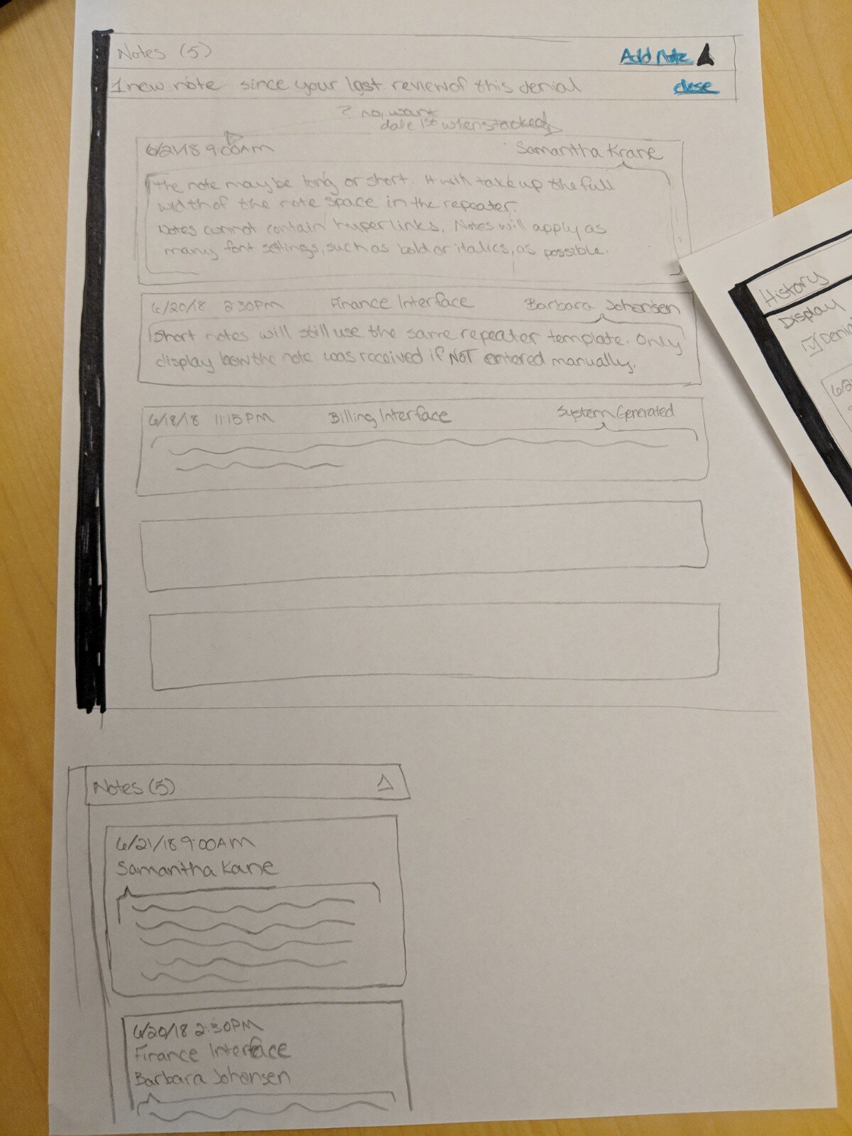
Single location for Notes - to support the increased need for team communication and improve efficiency’
Document attachment - to support including the required medical record evidence in the denial case record
The final scope also had to include the features of the current module. Any perceived loss of functionality would put us at risk of losing a client.
Scope for a Beta release was also put together to allow a few of our clients that were on this journey with us to get a sneak preview and provide a last chance for product feedback before the GA release. This scope only had the bare minimum fields needed to document a denial and associated appeals without the “bells and whistles” of the full product.
Developing new technology
Re-architecting from an antiquated technology, like ExtJS, to a new front-end stack is a big challenge. We still had to make the new D&A module fit into current Care Management application with all of the menus and and headers in the application. There were two false starts with identifying a technology that could fit modularly into Care Management without having to rebuild these common components.
I also had additional system requirements to support as seamless a transition for our clients as possible:
Support for both the legacy and new module for a year to allow clients to transition their teams on their schedule.
Keep the database and back end changes to a minimum to avoid data loss and the need to rebuild reports.
One of the developers finally solved the puzzle with Angular. A proof of concept was created and proved it could meet the product and technology needs. We included Bootstrap 4 as part of the stack to support the UI vision. The transition was not always smooth, but the development team has embraced Angular to solve my needed requirements.
The final look
After three long years, the final product finally launched. The biggest outcome was a measureable 20% decrease in the total time it took the Denial Management teams complete their Appeals process using the application.
This efficiency and cost savings created excitement with the user base and the Service/Support team. A bonus from these efforts is that a few clients that dropped Care Management in the past were interested in coming back because of these improvements. The client attrition did indeed stop, accomplishing one of the other major goals for the product.
It seems some of the major EHR players have missed the mark on their Denial Management products, which opened up opportunities for a bright future for CarePort Denial Management.
Screenshot of a denial case from CarePort Denial Management.
Beta screenshot while editing the Denial Summary section.


